
In 2021, the Liebherr website and many other media were given a new look and feel. The basis for this is the revised brand design. The Group has now won the Red Dot Award for this.
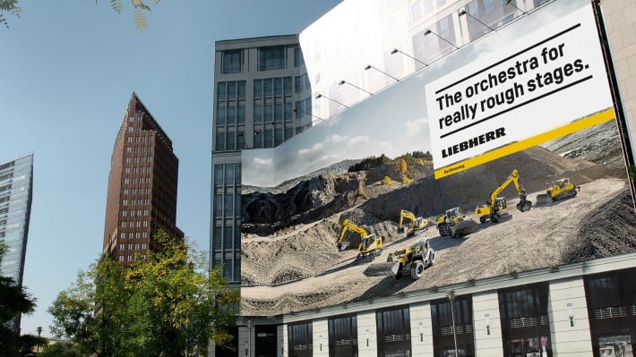
New design guidelines have been developed to ensure that everything really looks like the “Liebherr” brand; from the crane, to the production building, to the new customer portal. Specialists refer to the systematic design of contact points with the brand as “brand design”. The Liebherr Group recently revised its brand design and has now won the Red Dot Award in the category “Brands & Communication Design” for its efforts.
Liebherr manufactures construction machinery, refrigerators and many other products for its customers. The range comprises 13 product segments. 140 Liebherr companies around the world are responsible for development, production and service. On average, the company take part in more than 200 exhibitions around the world every year. Innumerable brochures, websites, online portals, films, pictures and illustrations give an insight into the Liebherr world. Everything should be visually unmistakeable in the way that it portrays the brand character and should enable the observer to intuitively experience Liebherr. The brand design describes how that works.
Revised design: Unmistakeable brand experience, high recognition value
The starting shot for revising the Liebherr brand design fell in 2017. Until then, a style guide had set tight limits on the creative freedom of Liebherr’s graphic designers. All printed pages were required to have the same appearance; social media profiles and web portals were to recreate the Liebherr website as faithfully as possible. The characteristic Liebherr logo was not ideally reproduced when it was used in a compact format in an app or as a favicon in a browser tab. So it was time for a cautious rejuvenation, to modernise the appearance of the company with a design that allows new media and new formats without completely abandoning tradition. The Design teams at Liebherr joined forces with the MetaDesign agency and other service providers.
Four years later, the designers presented the revised brand design to their colleagues from the Group. A special Liebherr font, a logo that has been optimised for digital media, a revised colour concept, a modular design system and many other elements make the Liebherr brand design a source of inspiration and a reliable guideline for employees. The elements can now be used for all media to create user-friendly and an unmistakeable brand experience with high recognition value. Even illustrations, films and animated graphics that clearly explain complex technologies and processes and which therefore have to be flexibly created are now always unambiguously identifiable as Liebherr designs.